Contextual Research: Zines


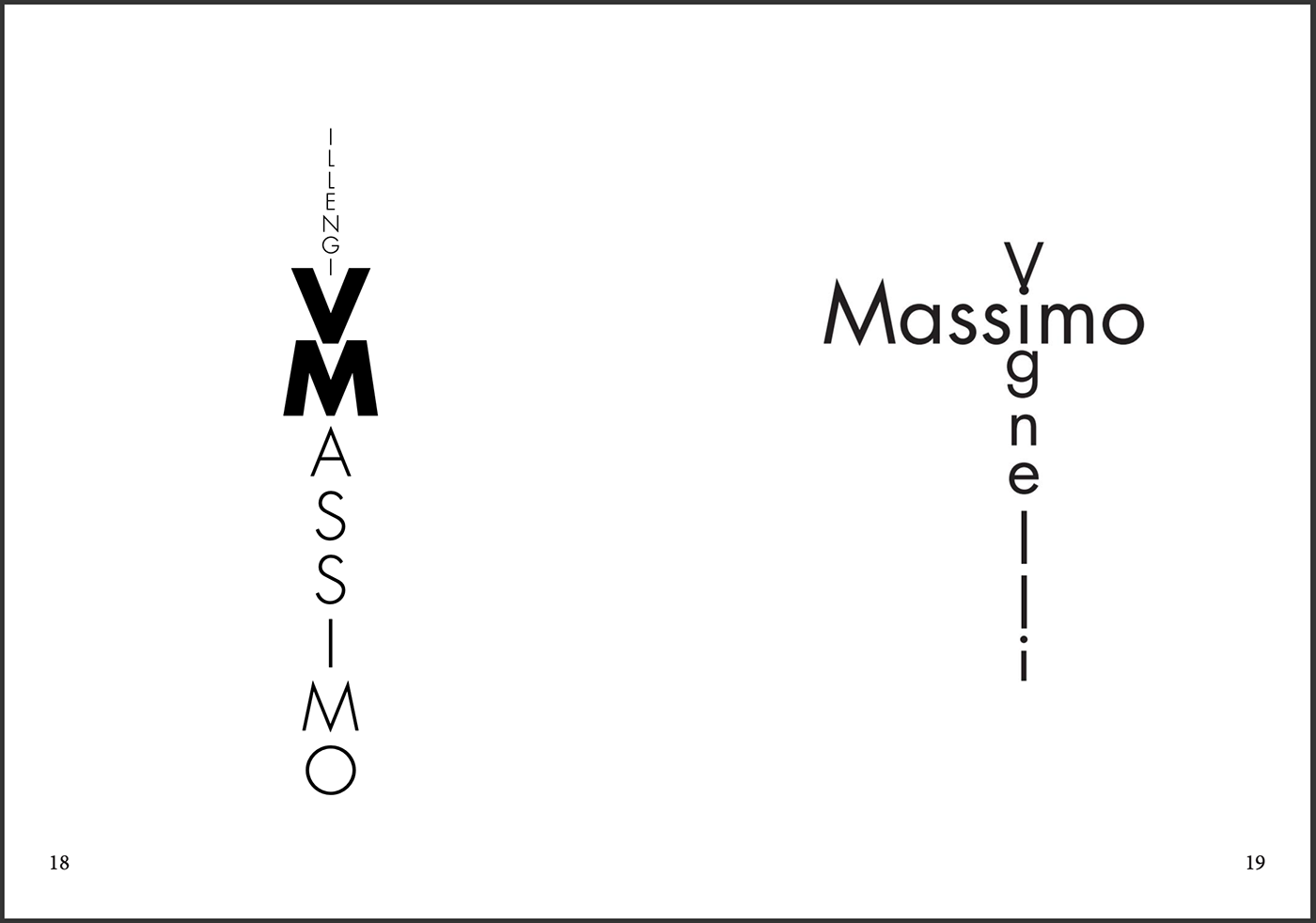

The above images are excerpts from a simplistic 40 page zine about Typographic Design, designed by Jezneel Ross. The zine focusses on 5 different typefaces, dedicating a slick black title spread to each one, with a consequent 2 spreads dedicated to examples of that typeface. Each spread employs different stylistic elements to make the text visually interesting and different from all other typeface demonstrations. This is achieved by using tools such as scale, shape (text being arranged into shapes), spacing, repetition, size, weight and layering. Although the same text is used to demonstrate each varying typeface, the use of these effects creates a diverse and visually engaging array of text that demonstrates the amount of design possibilities with the sole medium of text. I would like to employ similar techniques when designing my own text-based zine.
Reference: https://issuu.com/jezneelross/docs/zine3_type_2


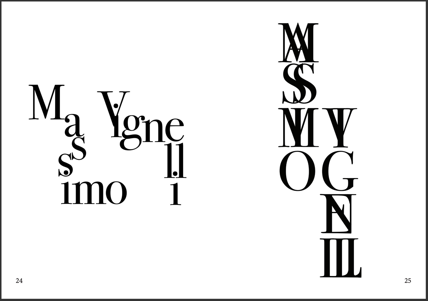
This zine is another example of a zine having a strict, focussed theme, as it focusses on a trip to Paris. It documents a short journey to Paris in December 2018, edited by Sin Hui Teh. This zine, similarly to the last, uses an extremely minimal colour palette of just black and white. Most of the interest sparked by this zine comes from the variance in chosen typefaces, and the shapes and imagery that dominate pages. Unlike the previous example, this zine does feature some imagery and shapes rather than solely text, but is still very text-heavy. The zine uses around 3 key typefaces to differentiate text, using a pixellated font to categorise dates and times, while using more legible fonts for the titles and body text. I really like how this zine creates visual intrigue through its use of simple shapes, for example many of these spreads contain minimal text which only occupies space at the top and bottom of each space, but the presence of a simple geometric shape gives these pages a sense of fullness without having to fill them out with written content. Although in my own zine I won't be able to use imagery or shapes, I have been inspired by this zine to possibly use text to construct shapes or imagery which can fill out my zine spreads to avoid overcrowding my zine spreads with written content. I also like the idea that by constructing shapes/images from text to occupy space, I will be able to manipulate text in an abstract way, allowing me to break away from a completely structured, informative style of zine.
references: https://fontsinuse.com/uses/25982/paris-zine

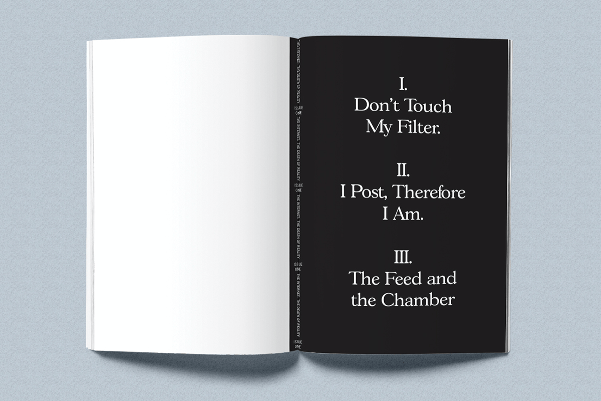


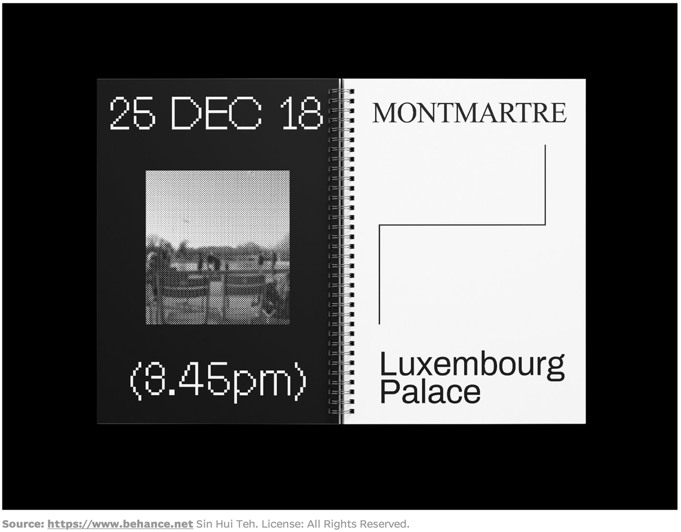
This zine is quite minimal like the other two I have looked at, its main difference to the previous two is its use of colour. This zine, alike to the others, represents a clear message throughout it, this being one's almost spiritual, inseparable relationship with the internet. Although this zine demonstrates a fairly wide selection of colours, only one flat colour is introduced on the left page opposite the permanent black and white colour scheme, making this a good example of how I could introduce one extra colour into my zine. A notable aspect of this zine is that each spread acts as a new title spread, with the bold title statement on the right and a flat colour with a small supporting image on the left side. This could be an option for how I choose to structure some of my zine spreads. Although I will be unable to use supporting imagery, I could experiment with constructing imagery from text, or use shading techniques or linework to make my chosen colours resemble something alike to imagery.
references: https://fontsinuse.com/uses/24332/print-is-dead-is-dead
Some other zine spreads that I found to be inspiring can be seen below:

Although this zine spread uses imagery, I really like the notion of something bold and heavily weighted obstructing the flow of background text. This makes me think that I could have my body text in the background and use large-scale letters to obstruct this text by placing it in the foreground and possibly altering its perspective, density, colour and weight.

I like the use of a grid in the background of this zine spread, and think that this could be an effective way of using a simple dual colour scheme in my own zine.
This zine spread prompted me to think that collaging text could be an interesting way to create diversity between text without being able to use images.

This spread demonstrates some ways that text can appear different by simply repeating it, or condensing or extending its height and width.

This spread demonstrates that the repetition of text in a simplistic way can create an effective background pattern that can be substituted for background imagery, and can frame what is in the foreground in an interesting way. It is also a good way to include multiple colours in a background.


These two spreads demonstrate how a theme can be extended by changing the positioning, orientation, scale, rhythm and typeface of similar text. This has been achieved by repeating the same motif (this motif being the same textual phrase) in visually contrasting ways.
